BRIEF_
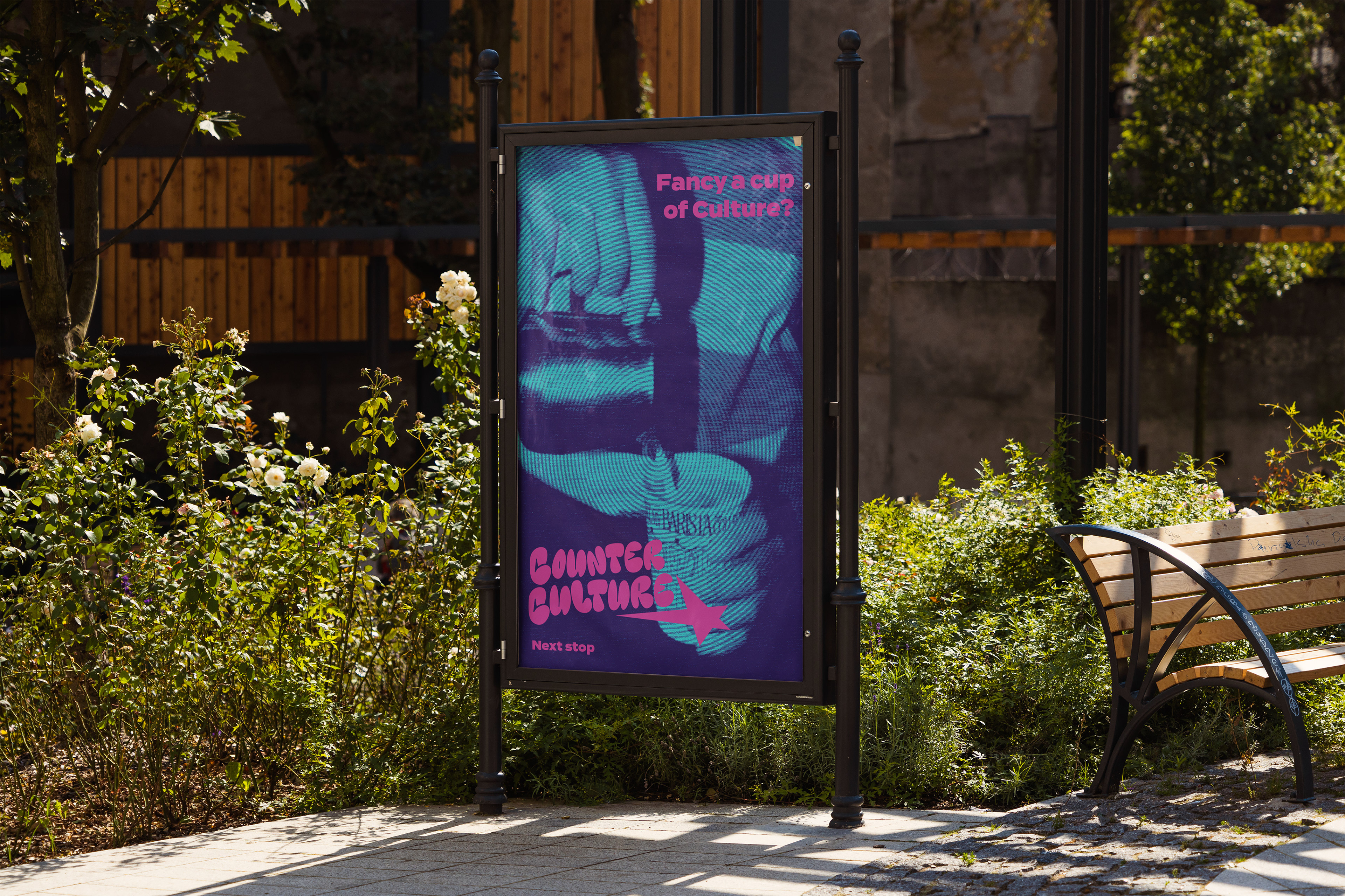
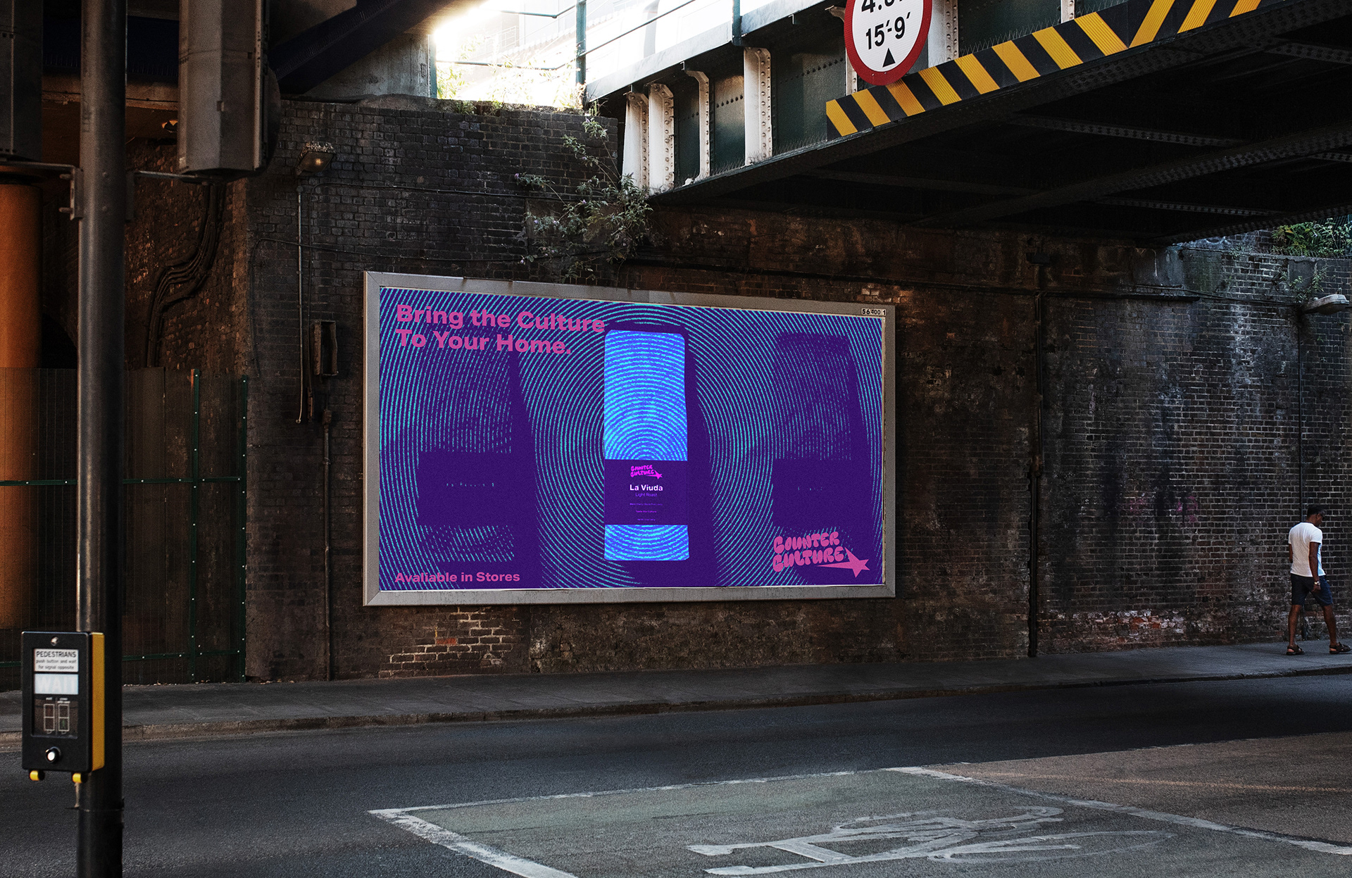
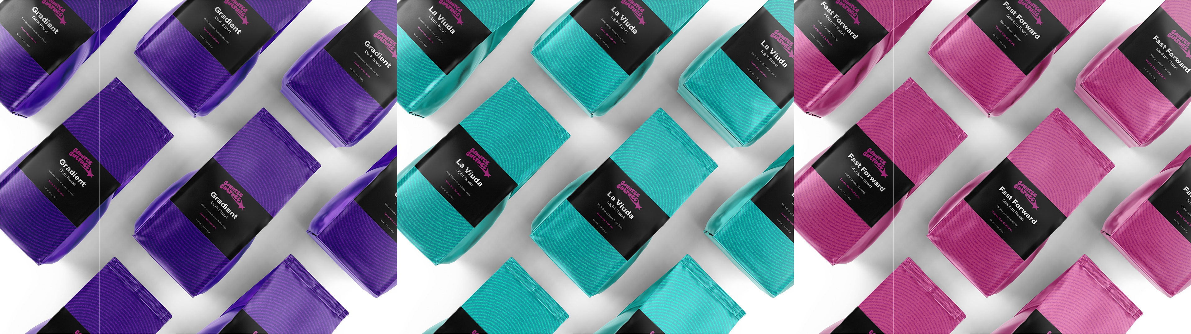
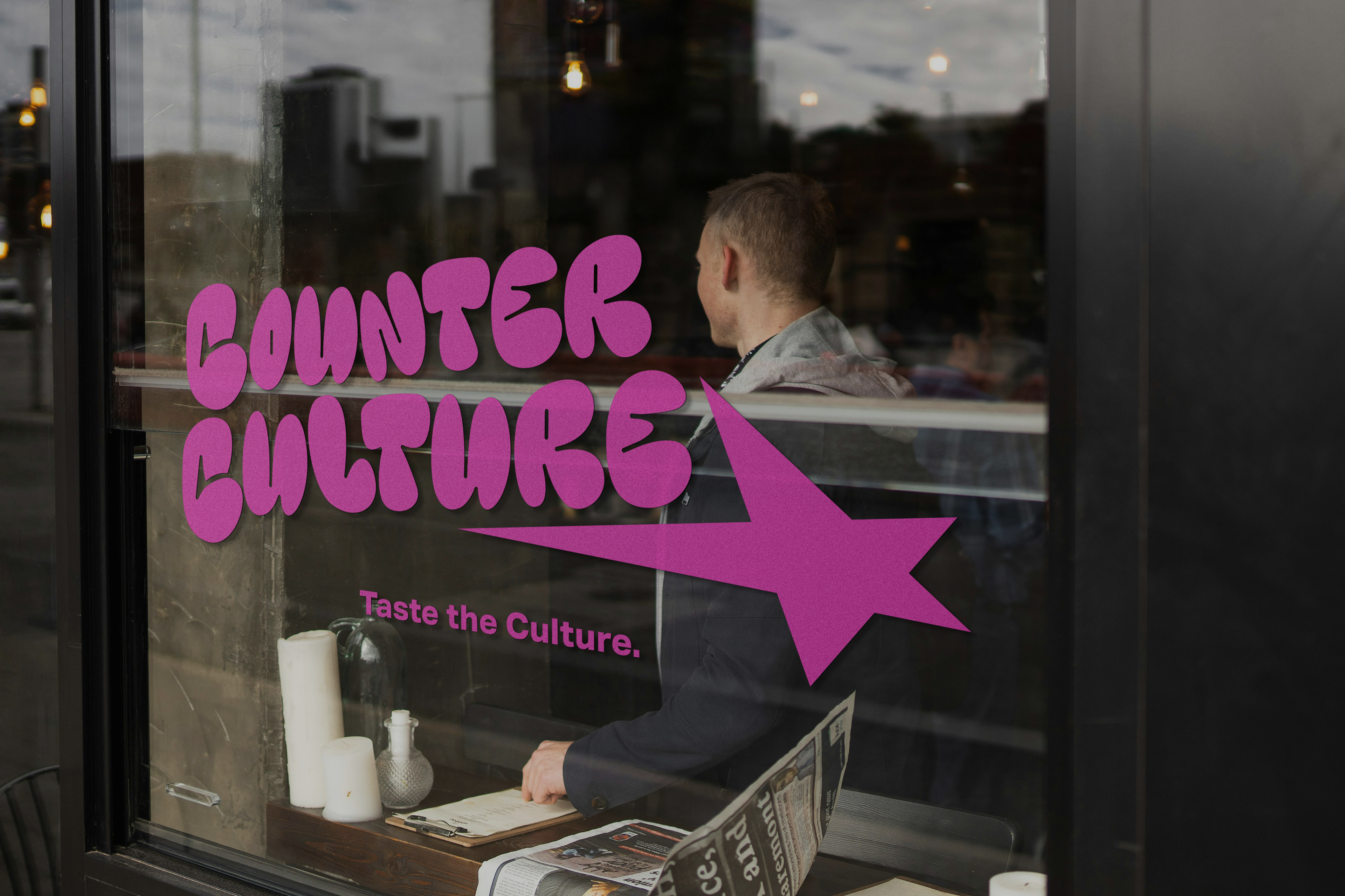
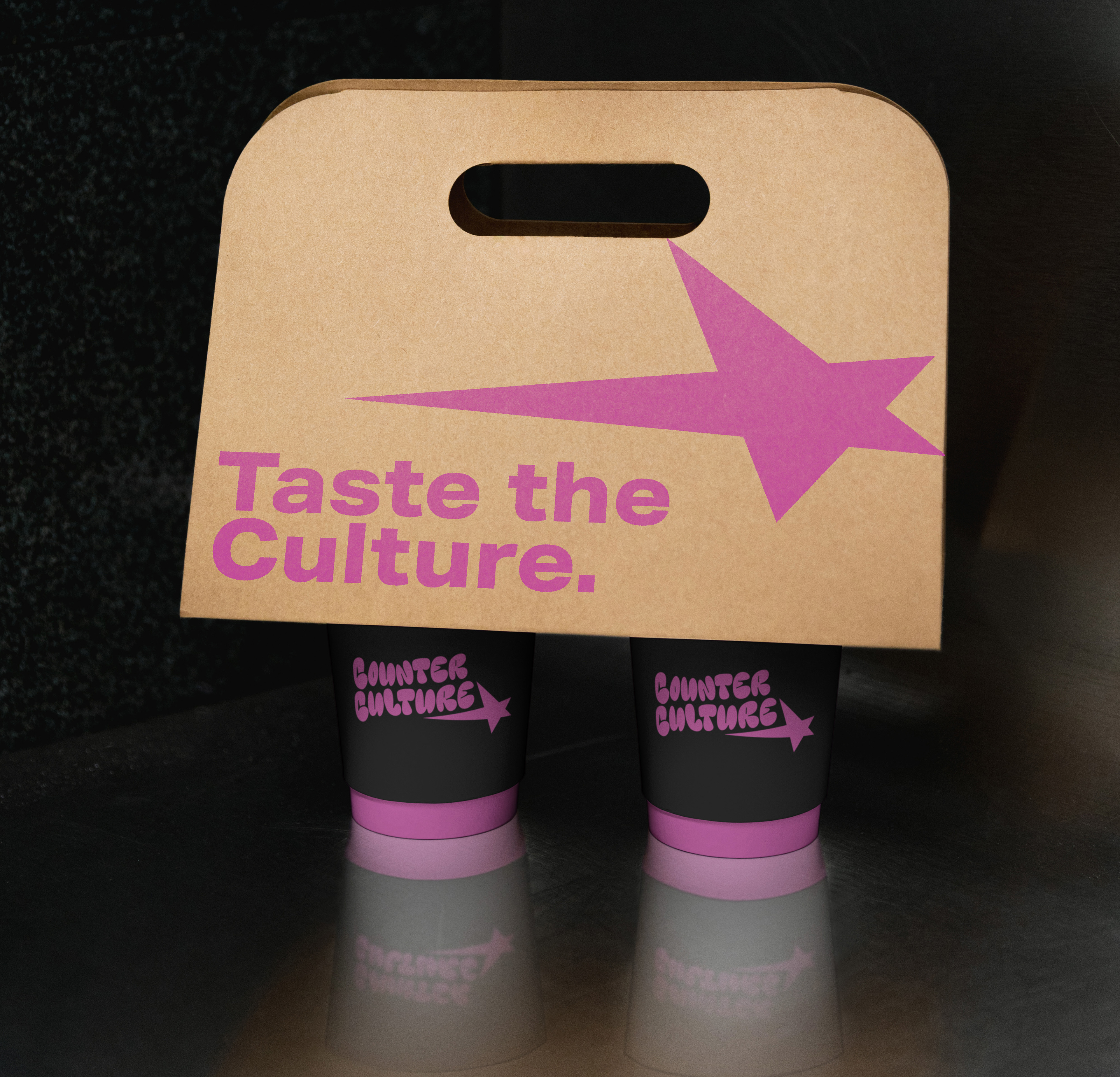
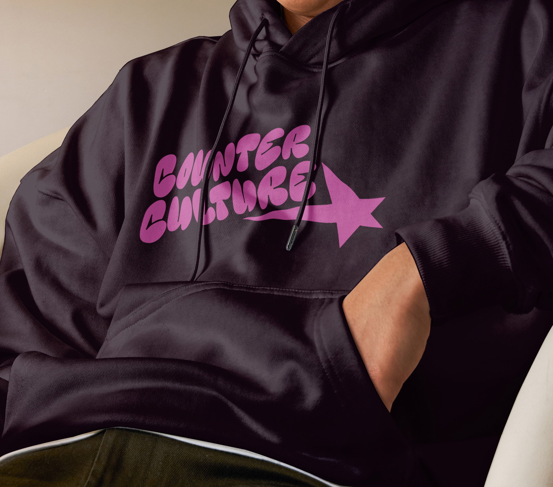
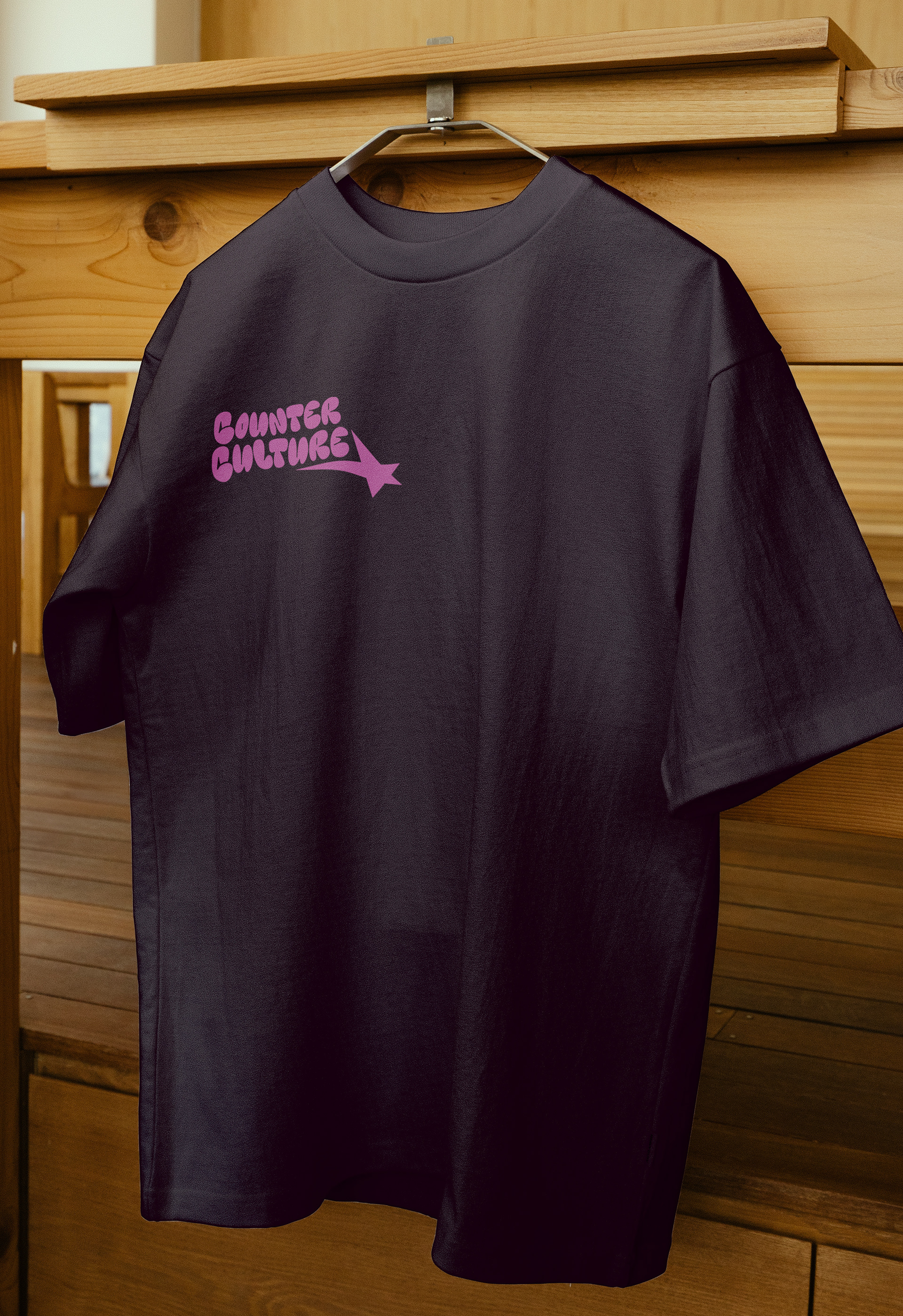
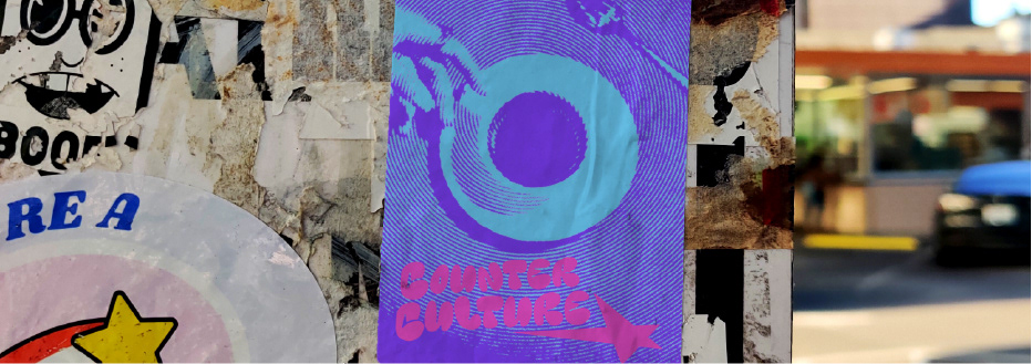
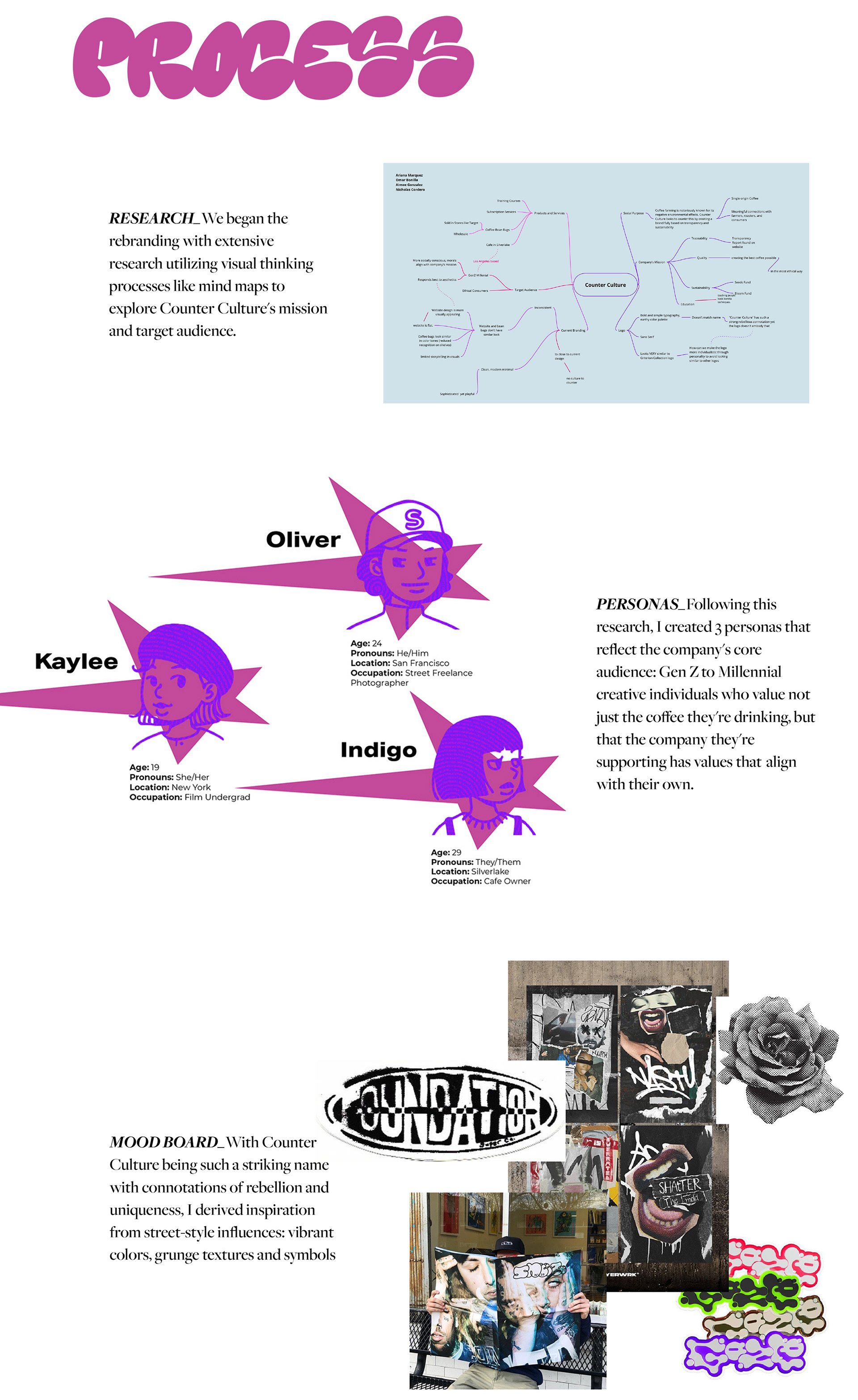
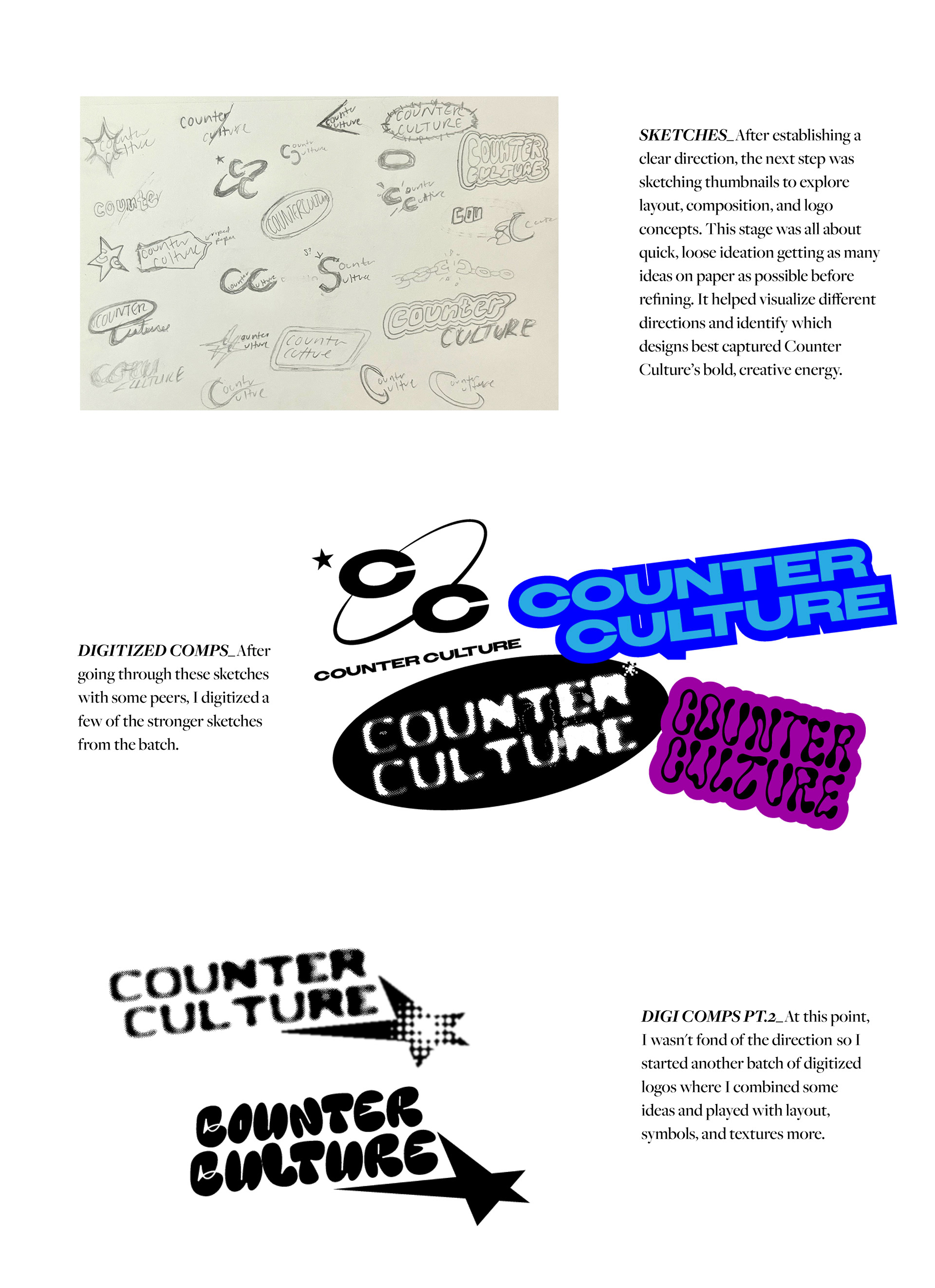
This student project focused on researching a sustainable coffee brand and developing an entire rebranding that reflects their mission and target audience. Counter Culture stood out to me for its striking name with connotation of rebellion, individuality and creativity.
PROCESS_We began the rebranding through extensive research utilizing visual thinking processes like mind maps to explore Counter Culture's mission and target audience.
PERSONAS_Following this research, I created 3 personas that reflect the company's core audience: Gen Z to Millennial creative individuals who value not just the coffee they're drinking, but that the company they're supporting has values that align with their own.
MOOD BOARD_With Counter Culture being such a striking name with connotations of rebellion and uniqueness, I derived inspiration from street-style influences: vibrant colors, grunge textures and symbols
SKETCHES_After establishing a clear direction, the next step was sketching thumbnails to explore layout, composition, and logo concepts. This stage was all about quick, loose ideation getting as many ideas on paper as possible before refining. It helped visualize different directions and identify which designs best captured Counter Culture’s bold, creative energy.
DIGITIZED COMPS_After going through these sketches with some peers, I digitized a few of the stronger sketches from the batch.
At this point, I wasn't fond of the direction so I started another batch of digitized logos where I combined some ideas and played with layout, symbols, and textures more.
FINAL DESIGN_
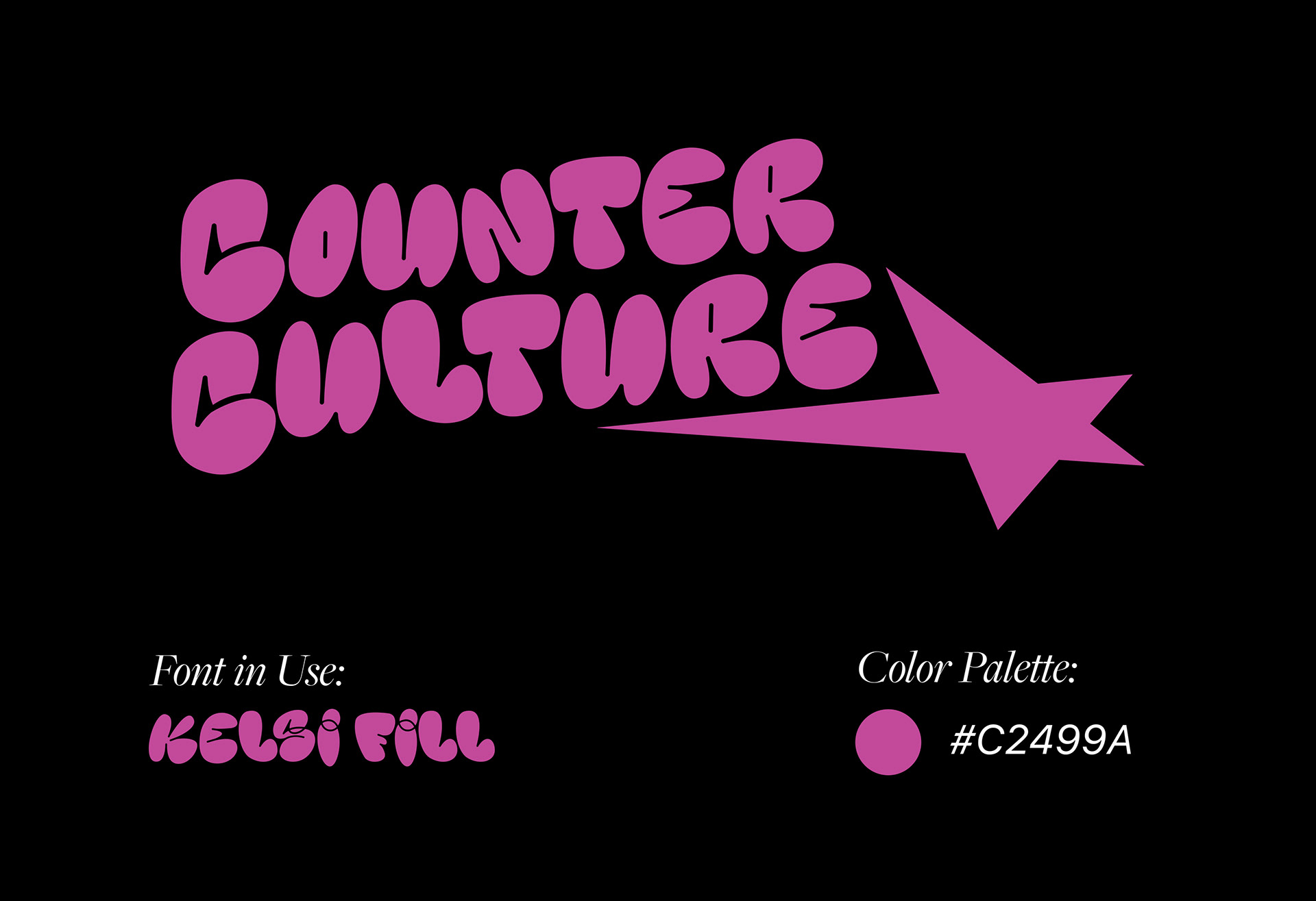
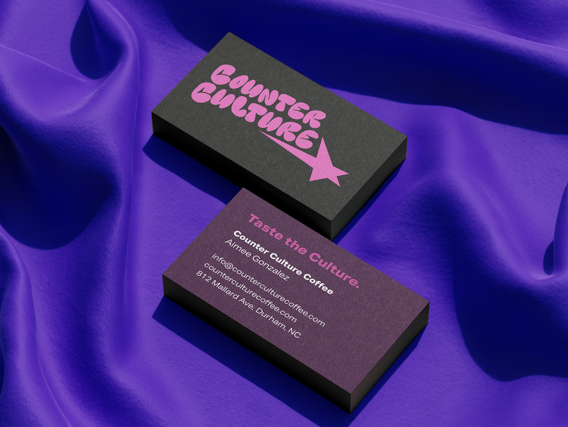
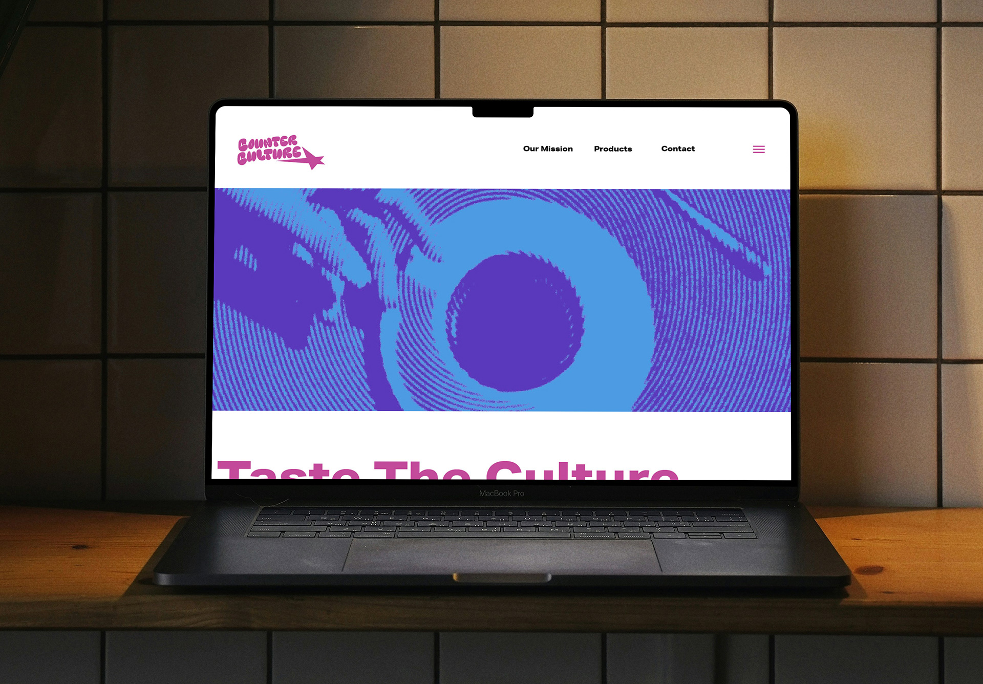
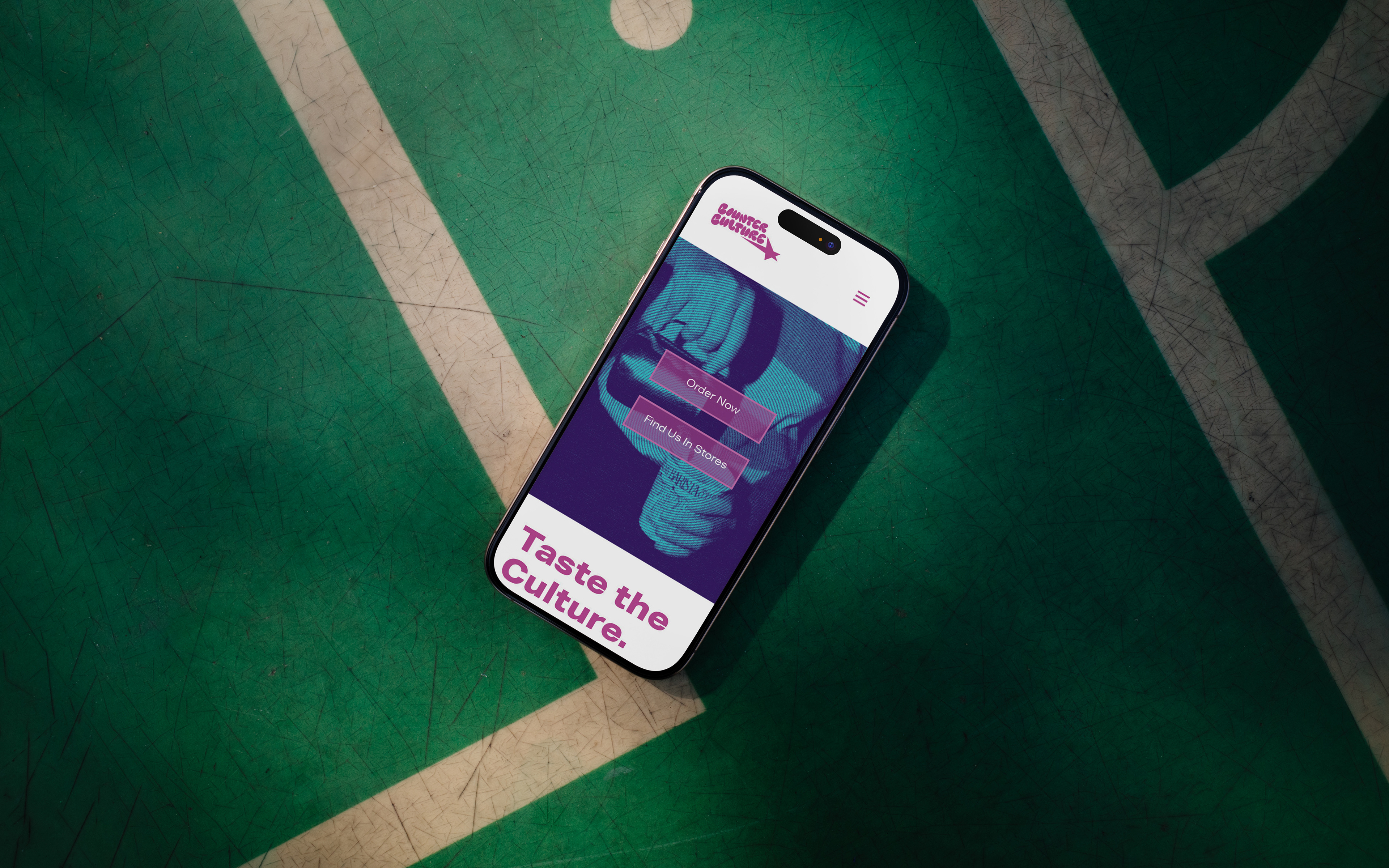
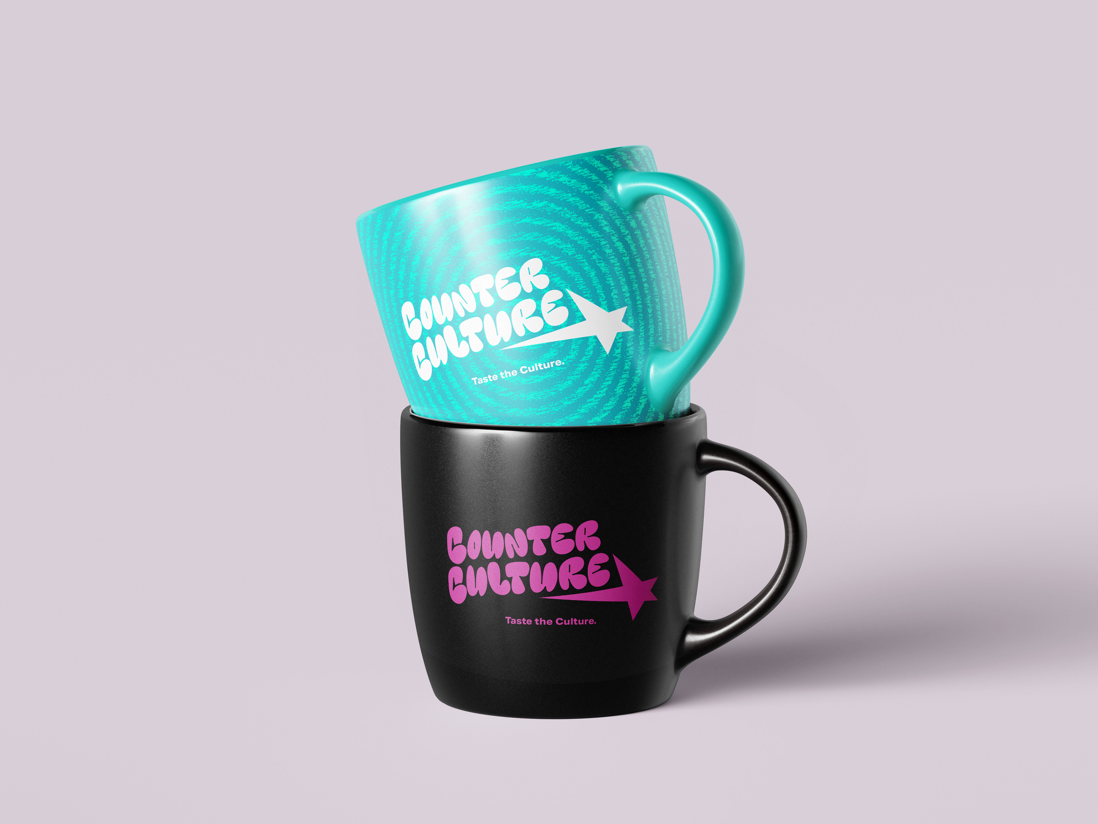
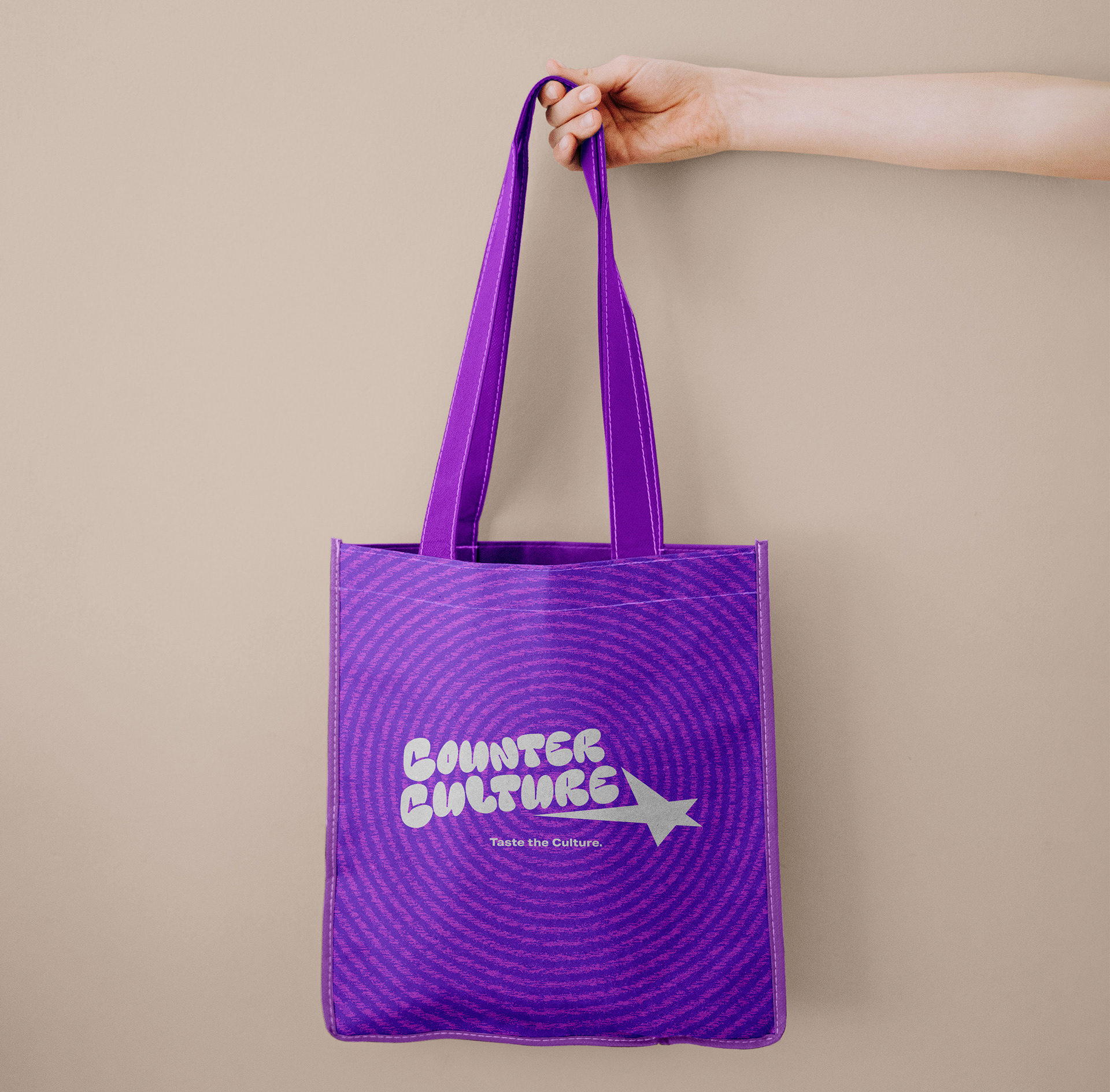
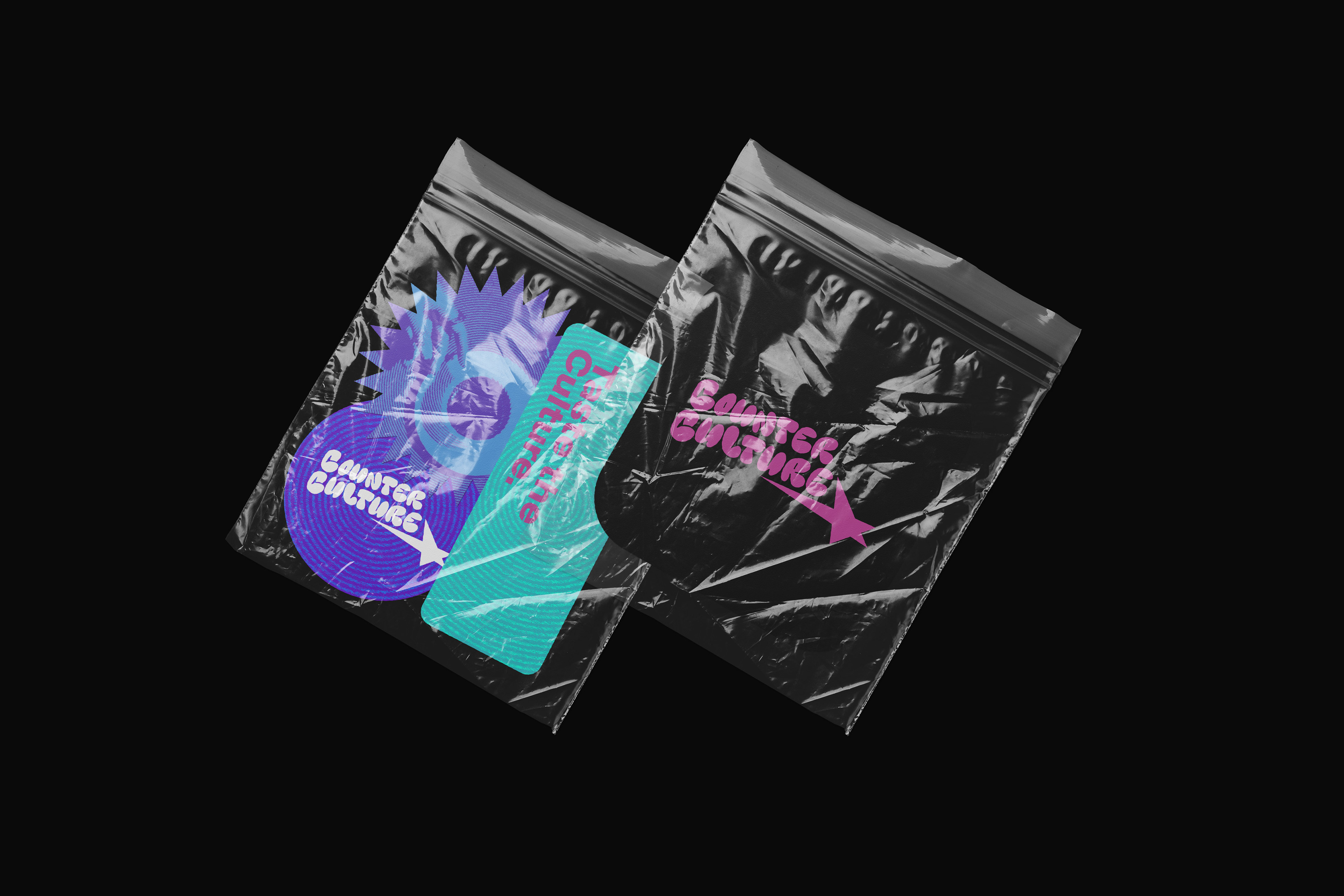
After receiving feedback from both my peers and professor, I landed on this final design of the logo. I made some minor changes to the display font as there was a weird overlapping, giving it a more polished look. My peers responded better to this logo as they noted that the star is playful, striking and memorable.